Living and working in Boston has shaped the way I see design. The city is not just a place I move through each day. It is a constant source of inspiration. Every street, building, and public space tells a story through color, texture, and form. Over time, I have come to see the city itself as a canvas, one that influences how I think visually and how I approach creative work.
The Rhythm of the City
Boston has a rhythm that becomes familiar once you start paying attention. The pace of foot traffic, the sound of trains, and the flow of cars all create a sense of movement. This rhythm often finds its way into my design work.
When I walk through the city, I notice how people move through space. I pay attention to how signs guide pedestrians, how storefronts catch the eye, and how streets open and close as you move through them. These observations help me think about flow in design. Just as a city guides people from one place to another, a good design should guide the viewer smoothly and clearly.
Architecture as Visual Language
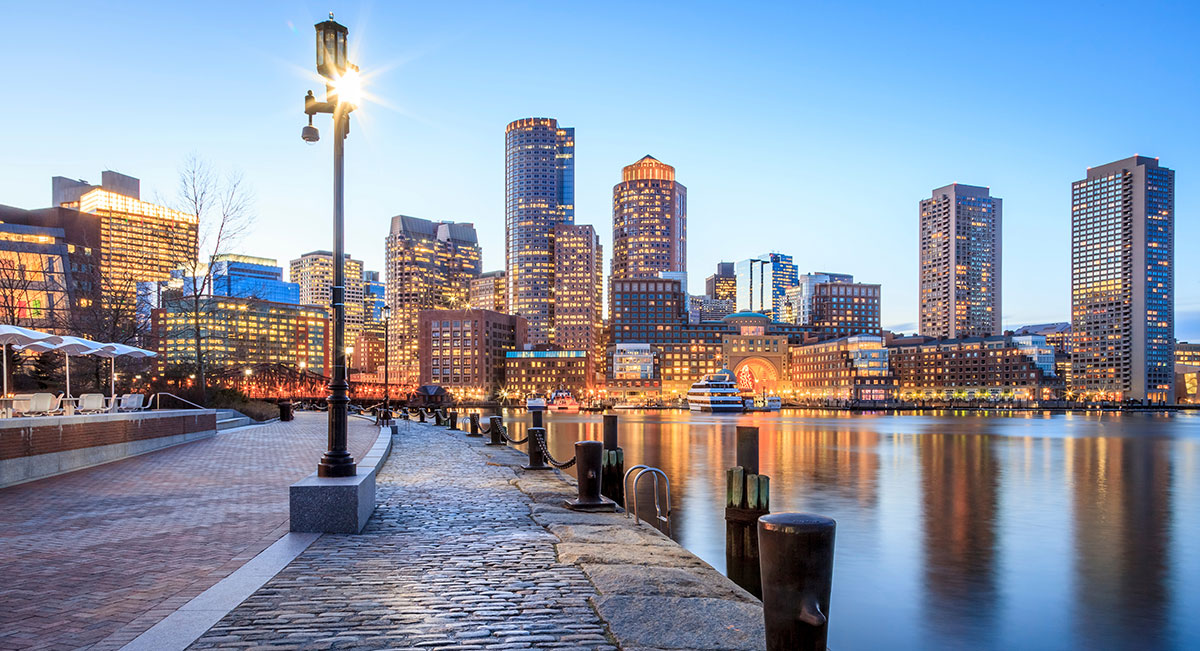
Boston’s architecture is layered with history. Brick buildings stand beside glass towers. Narrow side streets open into wide public squares. This mix of old and new creates visual contrast that feels both grounded and evolving.
As a designer, I often study these contrasts. The worn texture of brick next to clean metal surfaces reminds me that balance matters. Design does not need to feel overly polished to be effective. Sometimes, a sense of age or imperfection adds depth and character. Boston’s buildings show how different styles can exist together and still feel cohesive.
Street Details That Spark Ideas
Some of my best ideas come from small moments on the street. A faded sign above a corner shop. A pattern in the pavement. A reflection in a window as the light changes throughout the day. These details may seem ordinary, but they often carry strong visual impact.
I try to stay curious about these moments. I take mental notes or snap photos when something catches my eye. These details often influence color choices, layout ideas, or typography decisions later on. The city offers a constant stream of visual references, if you take the time to notice them.
Public Spaces and Shared Experience
Boston’s parks, plazas, and waterfront areas play an important role in shaping how people interact with the city. These spaces are designed for gathering, resting, and connecting. Observing how people use them teaches valuable lessons about human-centered design.
In these shared spaces, I watch how people respond to their surroundings. Where do they stop? What draws their attention? What feels inviting? These observations help me think about how design can create comfort and clarity. Good design, like a well-designed public space, should feel intuitive and welcoming.
Color in the Urban Landscape
The city has its own color palette. Red brick, gray stone, green parks, and the blue of the harbor all work together in a way that feels natural. Seasonal changes add another layer, from autumn leaves to winter snow and spring blooms.
These colors influence how I think about mood in design. Boston shows how a limited palette can still feel rich and varied. It teaches restraint and intention. Not every design needs bold color to make an impact. Sometimes, subtle tones and natural contrasts tell a stronger story.
Learning from Street Typography
Typography is everywhere in the city. Street signs, shop windows, posters, and murals all use type to communicate quickly and clearly. Some are beautifully designed. Others are purely functional. Both offer lessons.
I pay attention to how type is used in different contexts. What is easy to read from a distance? What feels personal or expressive? Boston’s streets show how typography plays a role in wayfinding, branding, and storytelling. These lessons carry directly into my design work, especially when clarity and tone matter.
Movement Through Neighborhoods
Each Boston neighborhood has its own personality. Walking through Beacon Hill feels different from moving through the Seaport or Back Bay. These shifts in atmosphere remind me that context matters.
Design should respond to its environment and audience. Just as a neighborhood reflects the people who live and work there, design should reflect the values and goals of those it serves. The city reinforces the idea that one approach does not fit every situation. Thoughtful design is adaptable and responsive.
Seeing the City as a Creative Partner
Over time, I have stopped thinking of Boston as just a backdrop to my work. It is an active part of my creative process. The city challenges me to look closer, think deeper, and stay open to inspiration in everyday settings.
By treating the city as a canvas, I allow it to shape my visual thinking. I learn from its structure, its chaos, and its quiet moments. Boston reminds me that creativity is not limited to a studio or a screen. It exists all around us, waiting to be noticed.
Conclusion
Boston’s streets have taught me how to observe, interpret, and translate visual experiences into design. The city’s rhythm, architecture, details, and shared spaces all contribute to the way I think creatively. By paying attention to the urban landscape, I have learned to design with greater awareness and intention.
The city is always changing, and so is my perspective. Each walk offers new insights and ideas. When I see the city as a canvas, creativity becomes part of everyday life, shaping not only my work but also the way I see the world around me.