As a graphic designer, color is one of the most powerful tools I have. It can set a mood, communicate a message, or evoke an emotional response. Over the years, I have realized that some of my strongest inspiration comes from the world around me, particularly through nature and travel. Observing how light, textures, and colors interact in real life has shaped the way I approach design, helping me create visuals that feel alive, vibrant, and authentic.
Observing Nature’s Palette
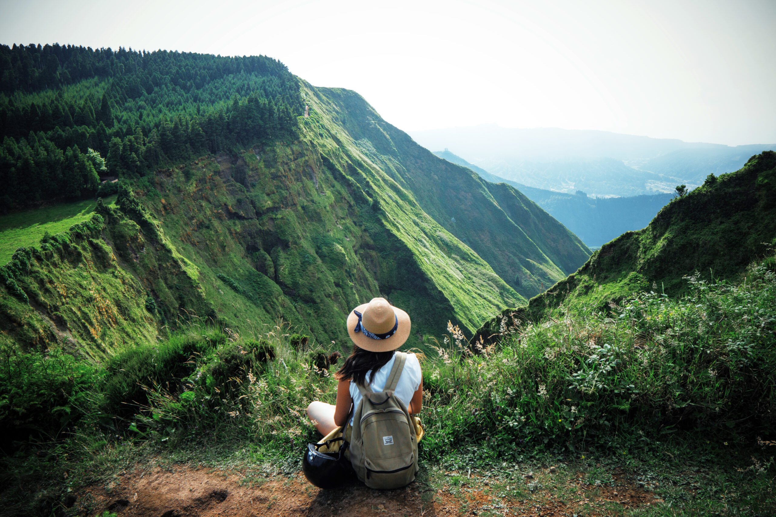
Nature has an incredible ability to surprise and inspire. Growing up in New England, I spent a lot of time exploring the coastlines, forests, and gardens around me. The changing seasons offered a constantly evolving color palette. In spring, soft pastels and fresh greens dominate. Summer brings bright blues of the sky and ocean alongside bold floral hues. Fall is filled with warm reds, oranges, and golds. Winter tones are more muted, with icy blues, grays, and deep evergreens.
Observing these shifts has taught me that color is not static. It moves, changes, and interacts with its environment. When I design, I try to replicate that sense of movement and adaptability. A single color can feel different depending on the surrounding elements, just like a leaf can appear golden in one light and brown in another. Paying attention to these subtleties helps me create designs that feel natural, balanced, and dynamic.
The Influence of Travel
Travel expands the ways I see and use color. Visiting new places exposes me to unexpected combinations, cultural symbolism, and unique ways that people interact with visual environments. A market in Morocco might be filled with vibrant oranges, deep purples, and rich turquoise. Streets in Lisbon may feature intricate tilework with colors that seem almost musical in their rhythm. Even a quiet village in Italy can teach lessons in subtlety and elegance through soft ochres and muted terracotta.
These experiences remind me to be adventurous in my design choices. Seeing colors in different contexts helps me break out of habitual palettes and explore combinations I might not have considered in a studio setting. It encourages experimentation while keeping balance and harmony in mind. Travel teaches that color is not just a visual tool. It tells a story, communicates culture, and evokes emotion.
Translating Observation into Design
The challenge is not simply noticing beautiful colors, but translating them into something that works within a design project. I often take photographs, make sketches, or collect swatches from my surroundings while traveling. Later, I reference these observations when creating palettes for logos, websites, or branding projects.
I also pay attention to the context in which colors appear. In nature, shadows, reflections, and textures influence perception. A shadow can deepen a color and give it weight. Water can reflect light and add vibrancy. Translating these lessons into design means thinking about contrast, layering, and interaction between colors. This approach ensures that the designs I create are dynamic and multi-dimensional rather than flat or predictable.
Emotional Resonance Through Color
Color is not just aesthetic. It communicates feeling. By observing how colors make me feel in different environments, I can better anticipate how an audience might respond to design choices. Bright, warm colors might convey energy and excitement. Cool, muted tones may feel calm and sophisticated. Nature and travel provide countless examples of emotional resonance in real time, giving me a library of experiences to draw from when making design decisions.
Constant Inspiration
The beauty of drawing inspiration from nature and travel is that it is always evolving. Each trip, hike, or even a quiet morning in the garden offers new perspectives. I notice patterns, contrasts, and harmonies that I can adapt into my work. Whether it is the deep indigo of a twilight sky, the bright yellow of a field of flowers, or the layered textures of a bustling market street, these moments become a visual vocabulary that I carry with me.
Using this inspiration does not mean copying what I see. It means translating it, abstracting it, and integrating it into my own creative expression. It is about capturing the essence of a moment, the feeling of a place, or the energy of a color interaction, and turning it into a visual solution that resonates with clients and audiences.
Conclusion
Color is a living, moving element in design, and the world around us offers endless lessons in how to use it effectively. Nature and travel provide experiences that sharpen observation, expand creativity, and encourage experimentation. By paying attention to the way colors interact in the environment, the way they shift with light, and the emotions they evoke, I am able to create designs that feel vibrant, intentional, and meaningful.
For me, design is a reflection of life itself, and the lessons I learn from the world around me ensure that every project I work on is infused with authenticity, inspiration, and a sense of motion. Whether I am drawing from a New England coastline, a bustling European city, or the quiet corners of a garden, the colors I see and experience continue to shape the way I tell stories visually.